Physical Address
304 North Cardinal St.
Dorchester Center, MA 02124
Physical Address
304 North Cardinal St.
Dorchester Center, MA 02124
If you ask most economists why Americans can’t afford homes, you’ll probably hear them blame some of the following: there’s not enough homes being built, zoning laws, NIMBYs blocking new construction. Sure these are issues, but we’re told that the housing affordability crisis is a supply problem. If we simply build more houses then prices will come down.
It sounds like a nice story, but it’s not the truth. The data will make that clear.
When you look at home prices not in dollars, but measured against the money supply, against gold, and against what a typical American actually earns, a very different picture emerges. Housing has never been cheaper in real terms, but it’s never been more unaffordable for the average worker. Both of those things are true at the same time. That tension is the whole story.
Why can’t Americans afford homes anymore? The data says it’s not a supply problem. Housing prices have grown faster than wages for over 50 years. But when you price homes in gold or against the total money supply, they’re actually at all-time lows. The problem isn’t that houses got more expensive. It’s that your paycheck got cheaper. This is a monetary policy story, not a supply story.
Let’s start with three simple numbers. From 1972 to 2025, here’s how three key benchmarks grew on an annualized basis:
| Metric | CAGR (1972-2025) |
|---|---|
| Median home price (MSPUS) | 5.37% |
| M2 money supply | 6.34% |
| Average wages (USWAG) | 4.27% |
Housing outpaced wages by about 1.1 percentage points per year. 1.1 percentage points sounds like a small increase, but compounded over 53 years, it means homes appreciated roughly 38% more in total than wages did.
Workers have been running on a treadmill that’s increasing in speed and incline.
Here’s where it gets interesting. The money supply grew faster than both wages and home prices. M2 (the broadest common measure of money in circulation, including checking accounts, savings, and money market funds) expanded at 6.34% annually (faster than homes and much faster than paychecks).
That one fact changes the entire framing of the affordability debate.
Most affordability discussions price homes in dollars. That’s understandable because we use dollars to buy everything. But dollars aren’t a fixed unit of measurement. Our economic system requires more and more dollars to be created just to function. So the value of the dollar decreases over time. It’s hard to measure the true value of something when your measuring stick is decreasing in value over time.
So what happens when you examine housing prices priced in something sturdier that can’t be printed?
Gold has been used as money for thousands of years. Its supply grows slowly and predictably. It can’t be created out of thin air like dollars can.
Below is a chart that takes the median average sales price of houses sold in the US priced in gold (MSPUS/Gold).
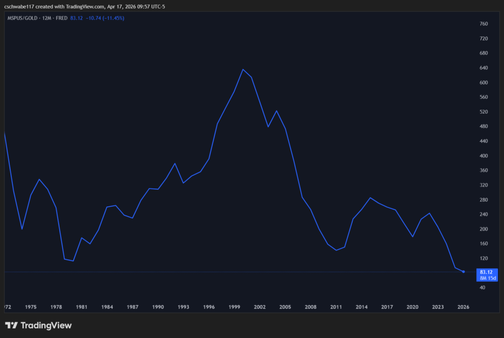
In 1972, it took around 460 ounces of gold to buy the median home. At the peak in the late 1990s and early 2000s, it took over 600 ounces.
Today? About 83 ounces.
In gold terms, housing has never been cheaper.
But I thought homes were expensive?
Well yes they are when priced in dollars. A fiat currency that loses its value year after year. So the question is, are homes really getting more expensive, or is the dollar simply losing its value?
Here’s the ratio that actually measures affordability for the typical person: median home price divided by average wages (MSPUS/USWAG).
Right now, that number is approximately 12,640. That means it takes about 12,640 hours of work at the average wage to buy a median home. Assuming a standard 2,000-hour work year, that means it takes 6.3 years worth of income to purchase a home. And even that comes with major caveats.
USWAG measures the average hourly wage BEFORE taxes. The MSPUS/USWAG ratio assumes that all of your wages are being used to purchase a home. This isn’t realistic because we all have bills and other required living expenses to pay.
Traditionally, a home should cost about 3 times your annual income. Right now were at 6.3 times…more than double.
The traditional rule of thumb is that a home should cost around 2.5 to 3 times your annual income. At 6.3 times, we’re more than double that threshold.
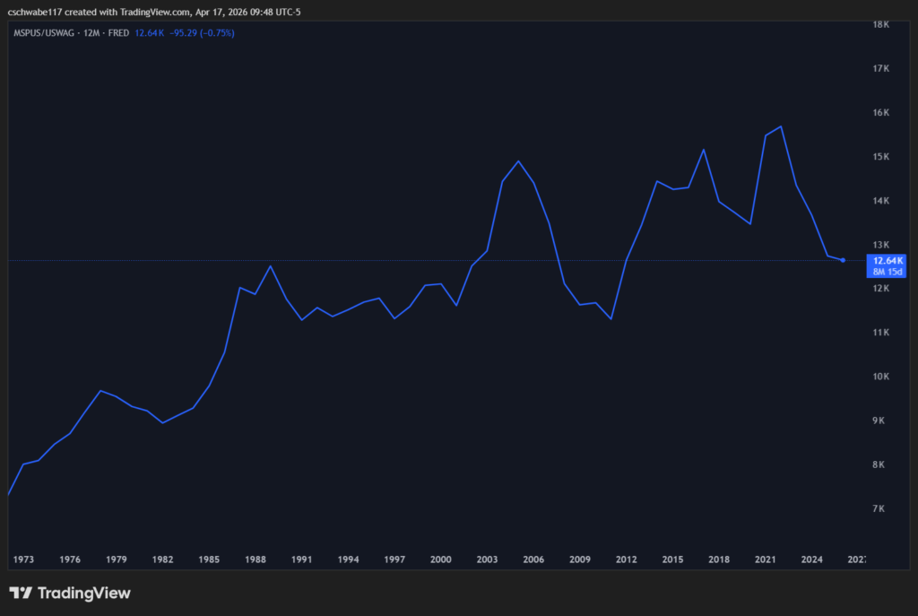
The average hourly wage right now is about $31.83 per hour. If your wage is lower than that, the ratio is even worse for you. If it takes 6.3 years of gross income at the average wage, think about what it takes at your wage.
And we can’t forget about the increases in the prices of groceries, utilities, child care, health care, etc.
For more on how wages have trailed inflation over the same period, see our breakdown at Wages vs. Inflation Since 1972.
The USWAG data uses average wages, which gets pulled upward by high earners at the top. When you swap in median personal income (MEPAINUSA646N on FRED), the ratio jumps to nearly 9 times income.
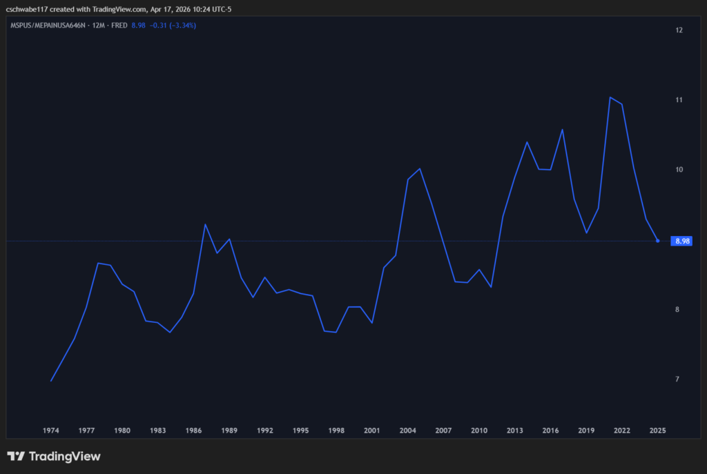
The difference between 6.3x and 9x comes entirely from the distortion that high earners create in the average. The typical American earns less than the average American. For that average American, the affordability crisis looks even worse than the headline numbers suggest.
There’s one more ratio worth looking at: MSPUS/ASPUS, or median home price divided by average home price. This tells you how skewed the distribution of home sales is (how far the luxury end of the market has run away from the middle).
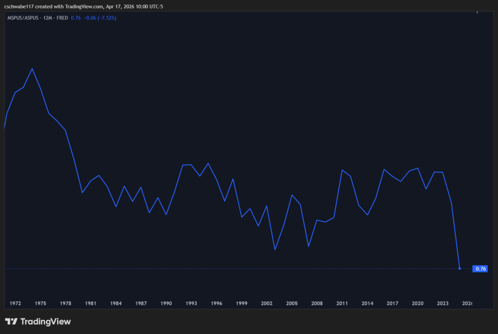
A ratio of 1.0 would mean median and average are the same (a balanced, even market). The current reading is 0.76, meaning the median home sells for 76 cents on every dollar the average home sells for. That ratio has been falling and moving sideways for the last 53 years. However, recently it has fallen off a cliff.
Here’s what’s happening. When expensive homes get more expensive faster than typical homes, the average gets dragged up and away from the median. Cash buyers who don’t care about mortgage rates, institutional investors, and luxury new construction have been inflating the top of the market. The median buyer (average American) is competing in a different market entirely.
The gap that’s opened up recently is the largest in the dataset. There’s almost two entirely different housing markets now. One for the rich, and one for everyone else.
The sales price of a home only tells one story. Most people get a 30 year mortgage and pay off their house over time. Interest rates are the other factor when it comes to home affordability.
Using FRED data for both median home prices and 30-year fixed mortgage rates, I created a chart that has the yearly median homes sales price, average mortgage rate, average monthly payment, average hourly wage, average hours work needed to pay monthly payment (USWAG/avg. monthly payment), and the total 30 year cost of the home (principal + interest).
This assumes a 10% down payment on the home, just to keep the data consistent.
| Year | Median Home Sales Price | Average Mortgage Rate | Avg. Monthly Payment | Avg. Hourly Wage | Avg. Hours Worked Needed for Monthly Payment | Total 30yr Cost (P&I) |
|---|---|---|---|---|---|---|
| 1975 | $39,275 | 9.05% | $286 | $4.87 | 58.6 | $102,821 |
| 1980 | $64,750 | 13.74% | $679 | $7.13 | 95.2 | $244,298 |
| 1985 | $84,275 | 12.43% | $805 | $8.87 | 90.8 | $289,938 |
| 1990 | $122,300 | 10.13% | $976 | $10.34 | 94.4 | $351,535 |
| 1995 | $133,475 | 7.93% | $876 | $11.81 | 74.2 | $315,354 |
| 2000 | $167,550 | 8.05% | $1,112 | $14.29 | 77.8 | $400,358 |
| 2005 | $236,550 | 5.87% | $1,258 | $16.36 | 76.9 | $452,963 |
| 2010 | $222,700 | 4.69% | $1,038 | $19.22 | 54.0 | $373,780 |
| 2015 | $294,150 | 3.85% | $1,241 | $21.23 | 58.5 | $446,827 |
| 2020 | $328,150 | 3.11% | $1,263 | $25.16 | 50.2 | $454,682 |
| 2025 | $413,650 | 6.60% | $2,376 | $31.87 | 74.6 | $855,513 |
A few things stand out.
1980 and 1990 were the most brutal years in the dataset at 95 and 94 hours respectively. Those sky high interest rates made monthly payments punishing even on homes that cost a fraction of today’s prices.
2020 was actually the most affordable year in 50 years at just 50 hours of work per month. It took a once in a lifetime pandemic, but low interest rates on a $328,150 home produced a monthly payment of $1263. If you were able to purchase a home or refinance, then you were able to lock in an amazing deal.
One of the most important things to mention is that the current monthly hours needed to work to pay your monthly payment is almost exactly the same as it was in 1995. But there’s some major differences.
The first is that home buyers today ($413,650) are going into almost three times as much debt as homebuyers in 1995 ($133,475).
The second is that everything is more expensive today than it was in 1995. It doesn’t matter what sort of good or service it is.
2025 at 74.6 hours matches almost exactly where 1995 was at 74.2 hours. So in hours-worked terms, today feels like 1995. Except the total 30-year cost is nearly three times higher (855,513 vs 315,354) because prices have exploded even though rates are similar. You’re working the same hours for a much more expensive commitment.
Supply constraints are real in specific markets. Certain areas in the country have zoning and land use problems that restrict building. So if you live in an area like this, then supply matters.
But the “just build more houses” argument has a fundamental flaw when you look at the national data. If housing unaffordability were primarily a supply problem, you’d expect home prices to ebb and flow with the construction of new houses.
But this isn’t the case when you actually look at the data.
The chart below tells the real story. Prices go up and to the right almost the entire time regardless of whether starts are rising, falling, or flat. The one exception is the great financial crisis. This isn’t a supply story, it’s a monetary expansion story.
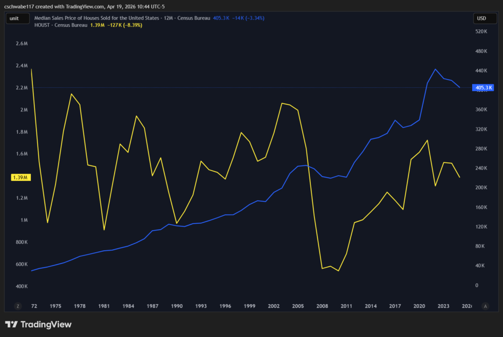
Even if millions of homes were built tomorrow, they’d still be priced in dollars that are being continuously diluted. The average American’s wage would be compounding at 4.27% in a world where the money supply compounds at 6.34%. The housing affordability crisis wouldn’t be solved, there would just be more houses regular people couldn’t afford.
Our economic system is the root problem.
For more on how money supply expansion affects asset prices across the board, see Analyzing the U.S. Money Supply: 1972 to Today and Annualized Returns of Major Assets: 1972 to Today.
If you’re someone trying to buy a home right now, the data validates what you’re experiencing. You’re probably trying to do all the right things, yet the American Dream is still out of reach for you. You’re probably not bad with money or not working hard enough.
The problem is you’re trying to buy an asset (house) that’s priced in a currency that’s being created and diluted faster than your wage can keep up with. Not to mention that everything else required to live is also increasing in price.
If you already own a home, then you’ve benefited from the system that rewards asset holders. The value of your home has probably increased, even if you haven’t improved your home that much.
My wife and I bought our house for $173,000 in 2018. The only “improvements” we’ve made to our house was getting a new roof because of hail damage and some nicer landscaping.
However, according to Zillow, our house is estimated to be valued at $289,000! And a house just two doors down recently sold for over $310,000!
This massive increase in price isn’t because of a supply problem, it’s because the dollar worth less and less every year.
For a broader look at how different asset classes have performed against the money supply and inflation, see Asset Class Returns: 1986 to Present and Categories of Investment in a High Debt-to-GDP World.
Building more homes helps in specific markets. But nationally, the data shows no correlation between home prices and new construction. Even if more homes were built, they’d be priced in the same inflating dollars that workers’ wages can’t keep up with. Supply alone doesn’t solve a monetary problem.
By total 30-year cost, 2023 was the worst year on record at approximately $944,000 in total payments on a median home with 10% down. The combination of peak prices and mortgage rates jumping from 3% to nearly 7% in two years created a double squeeze that hasn’t been seen in the full dataset going back to 1972.
That number represents roughly 12,640 hours of work at the current average wage of $31.83 per hour to afford the median home at sticker price. That’s about 6.3 years of gross income. The traditional rule of thumb for home affordability is 2.5 to 3 times annual income. At over 6 times, we’re well beyond what’s considered normal. If your wage is below the average, your personal ratio is even higher.
It tells us the housing market is bifurcating. The ratio of median to average home price has been falling for decades, meaning the top of the market keeps pulling further away from the middle. Cash buyers, institutional investors, and luxury construction are inflating average prices while the median buyer competes in a market that’s increasingly being left behind. The gap recently hit its widest point in 53 years.
Gold isn’t perfect, but it’s useful precisely because it can’t be printed. Measuring home prices in gold strips out the effect of dollar creation and shows what’s happening to housing’s underlying value. In gold terms, homes are at an all-time low going back to 1972 (cheaper than after the 2008 crash and cheaper than the 1970s). That tells you a lot about how much of the dollar price increase is real appreciation versus monetary expansion.
Data Sources
All data sourced from the Federal Reserve Economic Data (FRED) database: MSPUS (median home sales price), USWAG (average wages), USM2 (M2 money supply), MEPAINUSA646N (median personal income), ASPUS (average home sales price), MORTGAGE30US (30-year fixed mortgage rate), and gold spot price (GOLDAMGBD228NLBM). Data covers 1972 to 2025 where available. Mortgage cost calculations assume 10% down payment, 30-year fixed term, annual average rates.