Physical Address
304 North Cardinal St.
Dorchester Center, MA 02124
Physical Address
304 North Cardinal St.
Dorchester Center, MA 02124
We’re going to look at how different types of US equity styles have performed since 1972, when the US left the gold standard. This will give us a complete picture of how equities have performed during the fiat world reserve currency era.
Then, we’ll compare the returns to inflation and the money supply. Why those two? Because we need to see if these equity styles created real wealth over time.
By the end of this article, you’ll understand what the different US equity styles are, how they performed over the years, whether or not they created real wealth, and what questions you should ask yourself before investing.
A note on the data: Performance data before 1992 comes from theoretical academic research (the Fama-French Data Library), not actual investable funds. Real investors during that time used active managers like the Vanguard Windsor Fund, which came with fees and trading costs not reflected in this data. For Micro Cap specifically, data before 1981 is theoretical (CRSP Decile 10). From 1981 onward, it reflects actual net-of-fee performance from the DFA US Micro Cap Portfolio (DFSCX) — the first fund to make that category investable.
Small Cap Value had the highest growth rate (CAGR) of any US equity style since 1972, at 13.41% per year
Small Cap Growth had the lowest at 9.77%. That’s a big difference when you let it compound for decades
A small difference in growth rate leads to massive differences in real money over time
Every US equity style beat inflation (CPI grew at 3.94% per year)
Every style also beat the growth of the US money supply (M2 grew at 6.63% per year)
Historical returns don’t tell the whole story. The economic era you’re investing in matters just as much
US equity styles are a way of organizing stocks into groups based on size and style.
This system helps investors spread their money across different types of companies so they’re not putting all their eggs in one basket.
Here’s a breakdown of each category, along with a reference ETF you can use for your own research. These are not recommendations, just a starting point.
US Market All publicly traded companies in the US, weighted by size. Contains large, mid, and small companies. Reference ETF: VTI
Large Caps The biggest companies in the US. Market cap of at least $10 billion. They make up roughly 70–80% of the total US stock market. Reference ETF: VOO
Mid Caps Companies with market caps between $2 billion and $10 billion. Often well-known brands that haven’t gone global yet. Reference ETF: VO
Small Caps Smaller, younger, or more niche companies. Market caps of $250 million to $2 billion. Reference ETF: VB
Micro Caps The smallest publicly investable companies. Market caps below $250 million. Reference ETF: IWC
Value Stocks that look cheap compared to their actual worth — like a brand-name product on sale. Value companies often pay dividends.
Growth Companies growing fast and reinvesting everything back into the business. Think high revenue growth and market dominance.
CAGR stands for Compounded Annualized Growth Rate. It’s the single most important number when comparing long-term investments.
Here’s a simple explanation for what it is:
“If I put money in at the start and didn’t touch it, what steady interest rate would have gotten me to today’s balance?”
CAGR takes the ups and downs of the market and turns them into one clean number you can actually compare.
A headline that says “the market returned 1,000% since 1980” sounds impressive. But that number means almost nothing without knowing how many years it took and whether inflation ate it up. CAGR puts everything on a level playing field.
Here are the CAGR’s of each US Equity Style from 1972 to 2024.
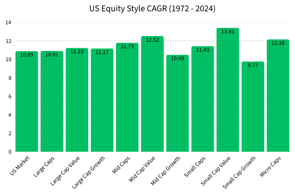
Small Cap Value had the highest CAGR at 13.41%. This is why many professionals still point to it as a strong long-term pick.
Small Cap Growth had the lowest CAGR at 9.77%. That 3.64% gap between Small Cap Value and Small Cap Growth might not sound like much. Wait until you see what it means in real dollars.
The Power (and Danger) of Small Differences
Numbers on a table are easy to ignore. So let’s make it real.
If you put $10,000 into each US equity style in 1972 and never touched it, here’s what you’d have in 2024:
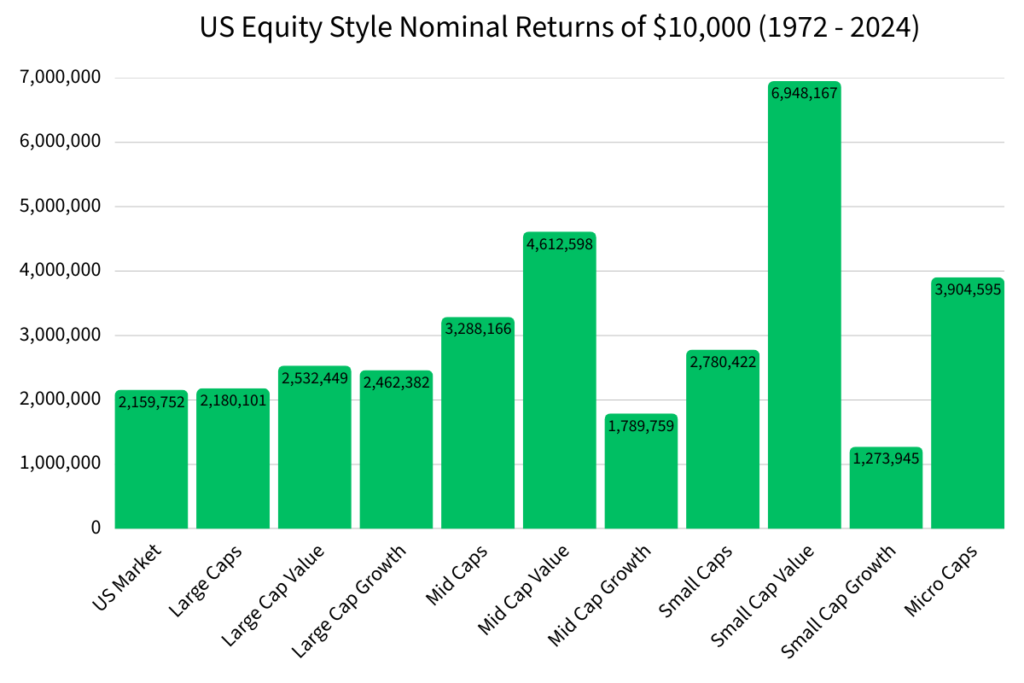
Look at Large Cap Growth (11.17% CAGR) versus the US Market (10.89% CAGR). That’s only a 0.28% difference. Barely anything, right?
Wrong. Over 52 years of compounding, that tiny gap turned into $302,630 more money.
For the average working person, $300,000 is life-changing. It’s the difference between retiring comfortably and working five more years.
This is why understanding your investments matters.
| US Equity Style (1972 to 2024) | CAGR | Nominal Return of $10,000 |
|---|---|---|
| Small Cap Value | 13.41% | $6,948,167 |
| Mid Cap Value | 12.52% | $4,612,598 |
| Micro Caps | 12.16% | $3,904,595 |
| Mid Caps | 11.79% | $3,288,166 |
| Small Caps | 11.43% | $2,780,422 |
| Large Cap Value | 11.23% | $2,532,449 |
| Large Cap Growth | 11.17% | $2,462,382 |
| Large Caps | 10.91% | $2,180,101 |
| US Market | 10.89% | $2,159,752 |
| Mid Cap Growth | 10.49% | $1,789,759 |
| Small Cap Growth | 9.77% | $1,273,945 |
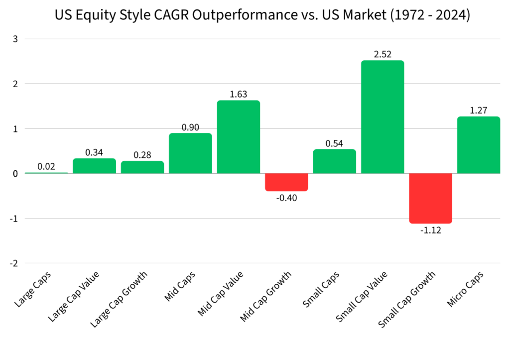
The US Market returned 10.89% per year. Most professional fund managers can’t beat that over a long time frame. Here’s how each equity style stacked up:
Small Cap Value’s 2.52% edge over the US Market is significant. Over decades, that compounds into an enormous gap.
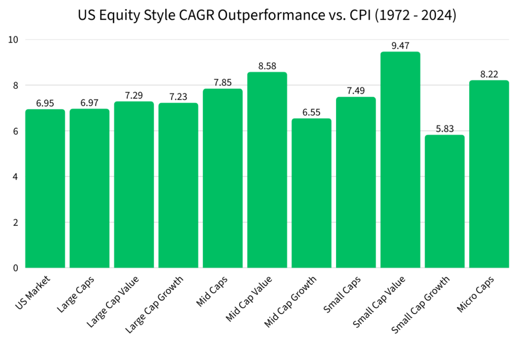
The US Market turning $10,000 into $2.1 million sounds incredible. But here’s what most financial websites don’t tell you: if inflation grew faster than your investment, you didn’t build any real wealth. You just stayed in place.
The Consumer Price Index (CPI) measures how much more expensive everyday goods and services get over time. It’s not a perfect measure of inflation, but it’s the most widely used one.
In 1972, the CPI was 42.5. By 2024, it rose to 317.6.
That’s a CAGR of 3.94% per year, meaning the cost of living grew at that rate.
Every single US equity style beat CPI. That’s the good news.
Beating inflation is one thing. But there’s another way your wealth can get eaten away: the growth of the money supply.
The M2 Money Supply tracks how many dollars exist in the economy. When the government or Federal Reserve creates more money, each dollar you hold becomes worth a little less.
From 1972 to 2024, the M2 Money Supply grew at a CAGR of 6.63% per year.
If your investments couldn’t beat that, you were losing ground in real terms, even if your nominal returns were increasing.
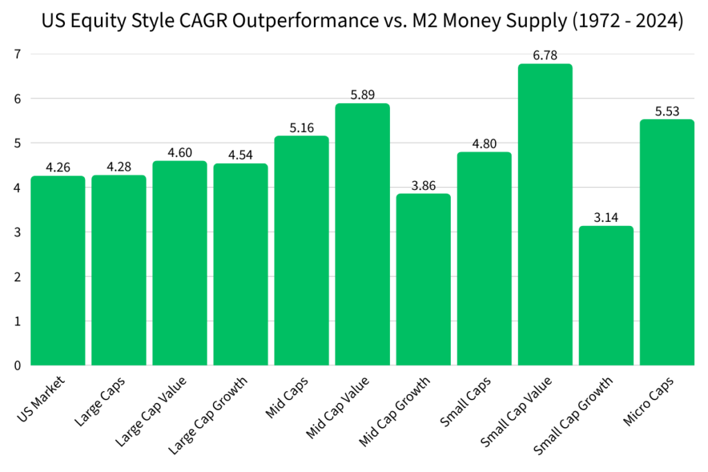
| US Equity Style (1972 to 2024) | Performance vs. CPI | Performance vs. M2 |
|---|---|---|
| US Market | 6.95% | 4.26% |
| Large Caps | 6.97% | 4.28% |
| Large Cap Value | 7.29% | 4.60% |
| Large Cap Growth | 7.23% | 4.54% |
| Mid Caps | 7.85% | 5.16% |
| Mid Cap Value | 8.58% | 5.89% |
| Mid Cap Growth | 6.55% | 3.86% |
| Small Caps | 7.49% | 4.80% |
| Small Cap Value | 9.47% | 6.78% |
| Small Cap Growth | 5.83% | 3.14% |
| Micro Caps | 8.22% | 5.53% |
A 52-year track record is useful, but it can hide a lot. The economy in the 1970s looks nothing like the economy today. Treating them as one big average can be misleading.
That’s why it helps to think about US equity style returns in three distinct eras:
Era 1 — Post-Gold Standard to 100% Debt-to-GDP (1972–2012) A long stretch of growth, rising debt, and shifting monetary policy. (Read more: US Equity Style Returns from 1972 to 2012)
Era 2 — Low Interest Rates and ~100% Debt-to-GDP (2013–2020) The era of cheap money, where growth stocks thrived. (Read more: Equity Returns during the ZIRP era)
Era 3 — Over 120% Debt-to-GDP (2021–Present) A new environment that may favor different strategies entirely. (Read more: Investing in a High Debt-to-GDP World)
What is a US equity style? A US equity style is a way of grouping stocks by two things: size (large, mid, small, or micro cap) and style (value or growth). Investors use these categories to understand and diversify what they own.
What does CAGR mean in simple terms? CAGR (Compounded Annualized Growth Rate) is the steady yearly growth rate that would get you from your starting balance to your ending balance. It smooths out all the ups and downs into one easy number to compare.
Which US equity style had the best long-term returns? From 1972 to 2024, Small Cap Value had the highest CAGR at 13.41%. A $10,000 investment would have grown to nearly $6.95 million over that period.
Which equity style performed the worst? Small Cap Growth had the lowest CAGR at 9.77% over the same period, turning $10,000 into about $1.27 million.
Did all equity styles beat inflation? Yes. All US equity styles outperformed CPI (which grew at 3.94% per year) and the M2 money supply (which grew at 6.63% per year) from 1972 to 2024.
Can I actually invest in these equity styles today? Yes. Each style has ETFs that track it closely. The article includes reference ETFs for each category. These are starting points for your own research, not investment recommendations.
Is Small Cap Value still the best choice today? There are a lot of financial advisors that still recommend investing in small cap value because of its historical returns. However, you have to ask yourself if current economic conditions will be beneficial for small cap value companies.
What is the M2 Money Supply and why does it matter? M2 measures how many dollars exist in the economy. When more dollars are created, each one is worth a little less. If your investments don’t grow faster than M2, your real purchasing power shrinks even if your account balance grows.
What is CPI and is it a perfect measure of inflation? CPI (Consumer Price Index) measures the average price change for a basket of everyday goods and services. It’s the most widely used inflation measure, but it’s not perfect.
Why does the article split history into three economic eras? Because the economy changes, and a single 52-year average can hide what’s actually happening in different periods. Separating returns by era helps investors understand whether the past still applies to today’s conditions.