Annualized Returns of US Equity Styles (1972-2024)
Below are CAGRs (Compounded Annualized Growth Rates) of US equity styles from the ending of the gold standard to today.
It’s important to look at CAGR because it accounts for “investing math”.
CAGR answers the question, “If I put money in at the start and don’t touch it, what steady interest rate would have gotten me to today’s balance?”
“Note: Performance data prior to 1992 represents theoretical academic research (Fama-French Data Library) rather than investable mutual funds. Actual investors during this period would have relied on active managers (like the Vanguard Windsor Fund) who faced transaction costs and fees not reflected in this theoretical data.”
Note on Data Sources: The Micro Cap performance shown prior to 1981 represents theoretical academic data (CRSP Decile 10) rather than an investable fund. Returns during this era do not reflect the significant trading costs and liquidity issues regular investors would have faced at the time. From 1981 onward, the data reflects the actual net-of-fee performance of the DFA US Micro Cap Portfolio (DFSCX), the first fund to make this asset class investable.
- What are US Equity Styles?
- Historical CAGR by US Equity Style (Post-Gold Standard)
- Nominal Returns of $10,000 Invested in Each US Equity Style
- Which US Equity Styles Outperformed the US Market?
- US Equity Style CAGR Compared to Consumer Price Index (CPI) CAGR (1972 – 2024)
- US Equity Style CAGR Compared to M2 Money Supply CAGR (1972 – 2024)
- What Does US Equity Style Historical Performance Mean for Today's Investors?
What are US Equity Styles?
US Equity Styles are a classification system used by investors to group stocks based on size (large, mid, small, micro) and style (growth, value).
They can be used to diversify your portfolio and make sure you’re not too over or underexposed in one area of the market.
Let’s define each US Equity Style before jumping into the returns. I also included a current ETF for each Equity Style. This is not an ETF recommendation, just a reference for your own research.
- US Market
- The US Market contains all investable publicly traded companies in the US. It’s weighted by market capitalization and contains large, mid, and small cap companies.
- ETF: VTI
- Large Caps
- These are the largest companies in the US. They have market caps of at least $10 billion. They represent the top 70% – 80% of the US market.
- ETF: VOO
- Large Cap Value
- Huge, slow growing companies that usually pay dividends.
- ETF: VTV
- Large Cap Growth
- Companies that dominate their sectors and have high revenue growth.
- ETF: VUG
- Mid Caps
- Mid Cap companies have market caps of $2 – $10 billion. They might be well known brands that don’t have a global influence yet.
- ETF: VO
- Mid Cap Value
- Mid sized companies in established industries.
- ETF: VOE
- Mid Cap Growth
- Disruptors expanding their market share rapidly.
- ETF: VOT
- Small Caps
- Small, young, or niche companies. They have market caps of $250 million to $2 billion.
- ETF: VB
- Small Cap Value
- Small companies undervalued by the market.
- ETF: VBR
- Small Cap Growth
- Young, aggressive companies reinvesting everything to scale.
- ETF: VBK
- Micro Caps
- The smallest tier of investable companies. Their market caps are less than $250 million.
- ETF: IWC
Historical CAGR by US Equity Style (Post-Gold Standard)
Here are the CAGR’s of each US Equity Style from 1972 to 2024.
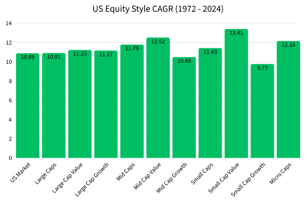
Small Cap Value had the highest CAGR at 13.41%. This performance is why a lot of professionals still recommend investing in this equity style. Historically, it has outperformed the US Market.
However, in future articles I will discuss why this may not be the case anymore.
Small Cap Growth had the lowest CAGR at 9.77%.
Nominal Returns of $10,000 Invested in Each US Equity Style
It can be hard to understand what CAGR actually means for your investments, so let’s look at an example to see how $10,000 invested in 1972 would look like in 2024 (this assumes that you let the $10,000 just sit there and reinvest dividends).
Remember, CAGR is essentially the interest rate of your investment.
So, we take $10,000 compounded at the CAGR of each US Equity Style over the course of 52 years (1972 – 2024).
Here’s the results.
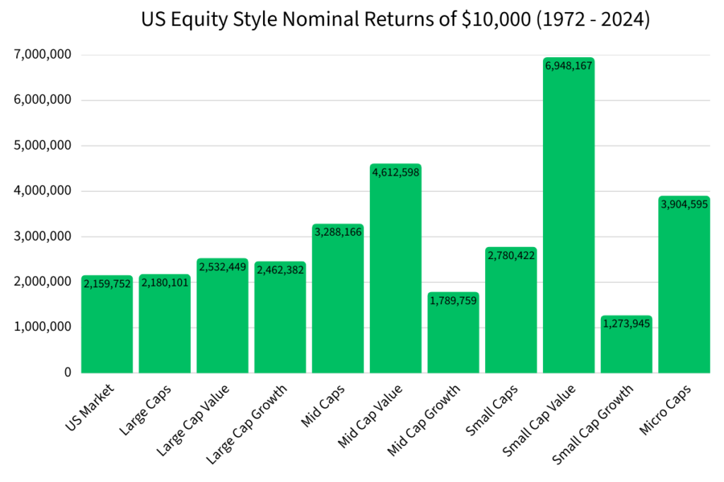
The nominal returns show the massive differences that CAGR can make in your investments.
If you look at the CAGR of Large Cap Growth at 11.17% and the CAGR of the US Market at 10.89%, the difference of .28% might not seem like a big deal. But when you take into account the years of compounding, the nominal difference in returns between Large Cap Growth and the US Market was $302,630.
That’s a significant amount of money for the average person.
| US Equity Style (1972 to 2024) | CAGR | Nominal Return of $10,000 |
|---|---|---|
| US Market | 10.89% | $2,159,752 |
| Large Caps | 10.91% | $2,180,101 |
| Large Cap Value | 11.23% | $2,532,449 |
| Large Cap Growth | 11.17% | $2,462,382 |
| Mid Caps | 11.79% | $3,288,166 |
| Mid Cap Value | 12.52% | $4,612,598 |
| Mid Cap Growth | 10.49% | $1,789,759 |
| Small Caps | 11.43% | $2,780,422 |
| Small Cap Value | 13.41% | $6,948,167 |
| Small Cap Growth | 9.77% | $1,273,945 |
| Micro Caps | 12.16% | $3,904,595 |
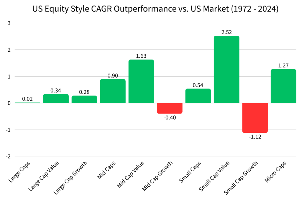
Which US Equity Styles Outperformed the US Market?
The US Market had a CAGR of 10.89% from 1972 to 2024.
It’s incredibly difficult for the average investor to outperform the US Market over a long period of time, but there were some US Equity Styles that outperformed the US Market.
Here are the US equity styles that outperformed the US Market.
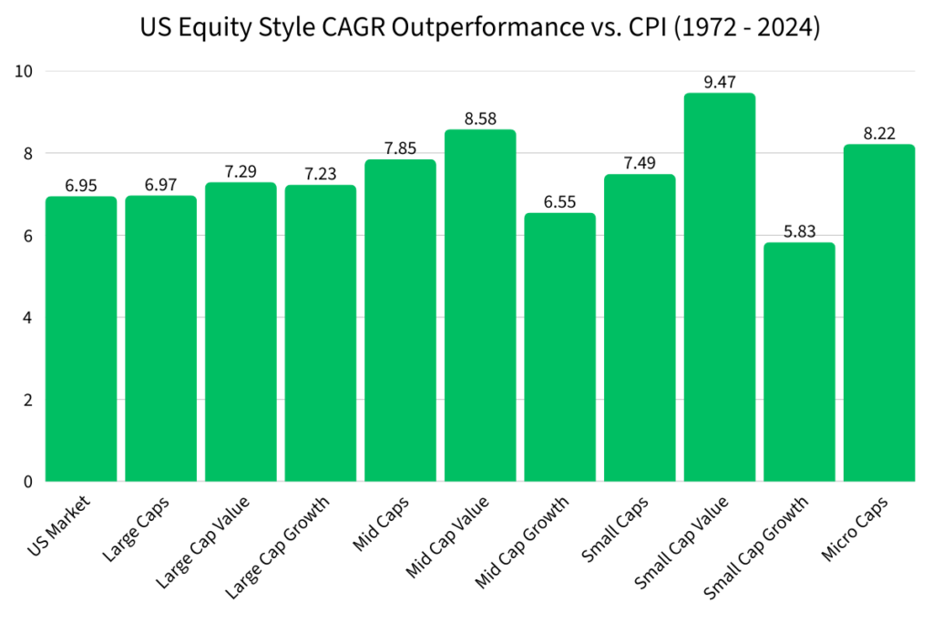
US Equity Style CAGR Compared to Consumer Price Index (CPI) CAGR (1972 – 2024)
Nominal returns show the overall growth of your investment without taking into account inflation or any external factors.
A nominal return of $2,159,752 for the US Market might seem like a lot of money, but if inflation grew at a faster pace than the US Market, you didn’t actually generate any wealth.
One measure of inflation is the Consumer Price Index (CPI). CPI measures the average change in prices paid by consumers. It’s not a perfect measure of inflation, but it’s the most widely used metric.
In 1972, the Consumer Price Index was at 42.5. In 2024, CPI rose to 317.6.
The CPI CAGR from 1972 to 2024 was 3.94%. This means that the cost of living increased by 3.94% per year.
Let’s compare each US Equity Style to CPI to see if they were able to outperform inflation.
US Equity Style CAGR Compared to M2 Money Supply CAGR (1972 – 2024)
The CAGR of the M2 Money Supply also needs to be taken into account when looking at returns.
The M2 Money Supply is a measurement of the dilution of the US Dollar over time. If your investments can’t keep up with the dilution of the US Dollar, then you aren’t really generating real wealth.
The M2 Money Supply had a CAGR of 6.63% from 1972 to 2024.
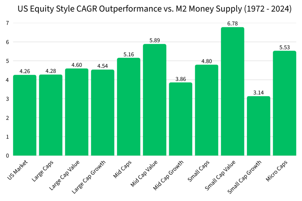
| US Equity Style (1972 to 2024) | CAGR Outperformance vs. CPI | CAGR Outperformance vs. M2 Money Supply |
|---|---|---|
| US Market | 6.95% | 4.26% |
| Large Caps | 6.97% | 4.28% |
| Large Cap Value | 7.29% | 4.60% |
| Large Cap Growth | 7.23% | 4.54% |
| Mid Caps | 7.85% | 5.16% |
| Mid Cap Value | 8.58% | 5.89% |
| Mid Cap Growth | 6.55% | 3.86% |
| Small Caps | 7.49% | 4.80% |
| Small Cap Value | 9.47% | 6.78% |
| Small Cap Growth | 5.83% | 3.14% |
| Micro Caps | 8.22% | 5.53% |
What Does US Equity Style Historical Performance Mean for Today’s Investors?
Learning about the historical returns of US Equity Styles gives investors more knowledge about the historical performance of the market. Through all of the ups and downs over the years, this is how the markets performed.
However, looking back at such a long time frame doesn’t take into account the changes that are happening in global economics.
That’s why I prefer to view US Equity Style returns, or any asset returns, in three categories.
From the ending of the Gold Standard to when the US hit 100% Debt to GDP (1972 to 2012).
Read More > US Equity Style Returns from 1972 to 2012
The US era of low interest rates and around 100% Debt to GDP (2013 to 2020).
The current era of over 120% Debt to GDP (2021 to present).
Read More > Investing in a High Debt to GDP World
By analyzing and understanding the economic conditions in each era, people can make better decisions on how to invest their money so they can generate real wealth over time.