Fixed Income ETF Performance (2013 – 2020): CAGR, Inflation, and Real Returns
Which bond ETFs actually grew your money – and which ones quietly eroded your purchasing power against inflation and M2 money supply growth?
TL;DR – Key Takeaways
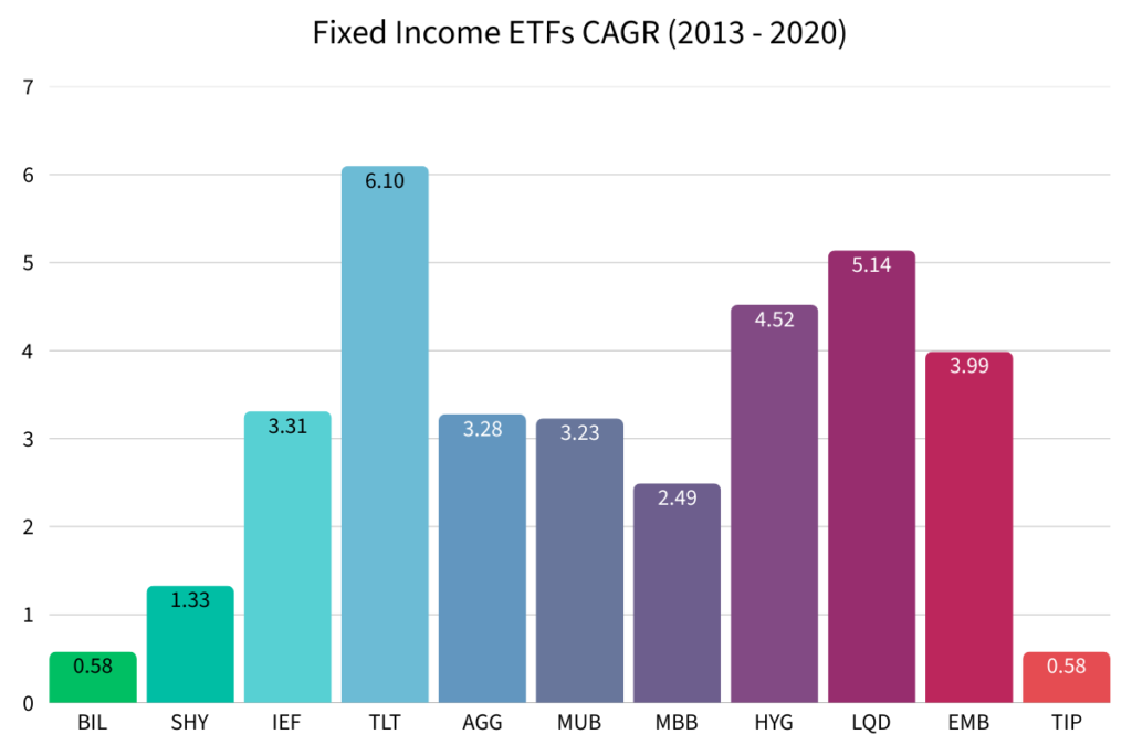
- TLT (Long Term Treasuries) led all ETFs with a CAGR of 6.10%
- BIL and TIP had the worst returns at 0.58% – barely above zero
- 8 of 11 ETFs beat CPI inflation
- Every single fixed income ETF lost purchasing power against M2 Money Supply Growth
In a previous analysis, I looked at fixed income performance using Portfolio Visualizer’s built-in asset class backtesting. This time, I’m using actual ETFs because that’s what most investors are holding in their portfolios.
I analyzed 11 fixed income ETFs covering the full spectrum from cash equivalents to riskier high-yield and emerging market bonds.
The goal: understand how each performed from 2013 to 2020, how they performed against inflation, and whether any of them built real wealth.
The 11 Fixed Income ETFs in This Analysis
These ETFs were chosen to cover every major category of the bond market.
| Ticker | Full name | Also known as | What it tracks |
|---|---|---|---|
| BIL | SPDR Bloomberg 1-3 Month T-Bill | Cash | 1-3 month US Treasury Bills |
| SHY | iShares 1-3 Year Treasury Bond | Short Term Treasuries | 1-3 Year US Treasury Bonds |
| IEF | iShares 7-10 Year Treasury Bond | 10 Year / Intermediate Treasuries | 7-10 Year US Treasury Bonds |
| TLT | iShares 20+ Year Treasury Bond | Long Term Treasuries | US Treasuries 20+ year maturity |
| AGG | iShares Core US Aggregate Bond | US Bond Market | Total US investment grade bonds |
| MUB | iShares National Muni Bond | Munis | Investment grade US municipal bonds |
| MBB | iShares MBS ETF | Mortgage Bonds | Investment grade mortgage-backed securities |
| HYG | iShares iBoxx High Yield Corporate | Junk Bonds | High yield corporate bonds |
| LQD | iShares iBoxx Investment Grade Corp | Investment Grade Bonds | Investment grade corporate bonds |
| EMB | iShares JP Morgan USD EM Bond | Emerging Market Bonds | USD-denominated emerging market bonds |
| TIP | iShares TIPS Bond ETF | Inflation Protected | Inflation-protected US Treasury Bonds |
All CAGR figures below assume you invested $10,000 at the start of 2013, reinvested all dividends, and held through the end of 2020 without buying or selling.
Which Fixed Income ETF had the Best CAGR?
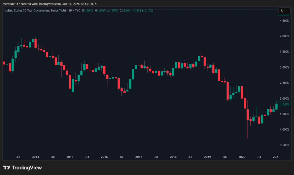
TLT (iShares 20+ Year Treasury Bond ETF) had the highest CAGR of all 11 ETFs at 6.10%. The reason comes down to interest rate movement during this period.
The 30-year US Government Bond Yield peaked near 4.00% at the start of 2014. Over the next six years it drifted lower (trading between 2.50% and 3.50%) before the pandemic pushed rates to historic lows in 2020. When long-term yields fall, long-duration bond prices rise. That drove TLT’s strong performance throughout the period.
Which Fixed Income ETF had the Worst CAGR?
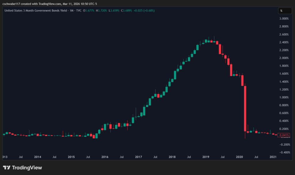
Both BIL (Cash) and TIP (Inflation Protected Bonds) had the lowest CAGRs at 0.58%. To understand why, we need to look at what the Federal Reserve was doing with short-term interest rates.
The 3-month US Government Yield was essentially zero from 2013 to 2016. Cash was yielding almost nothing. The Federal Reserve began raising rates in late 2016 (peaking around 2.00%) before cutting again and dropping them back to zero during the pandemic.
When the Federal Reserve sets rates near zero, BIL yields near zero as well.
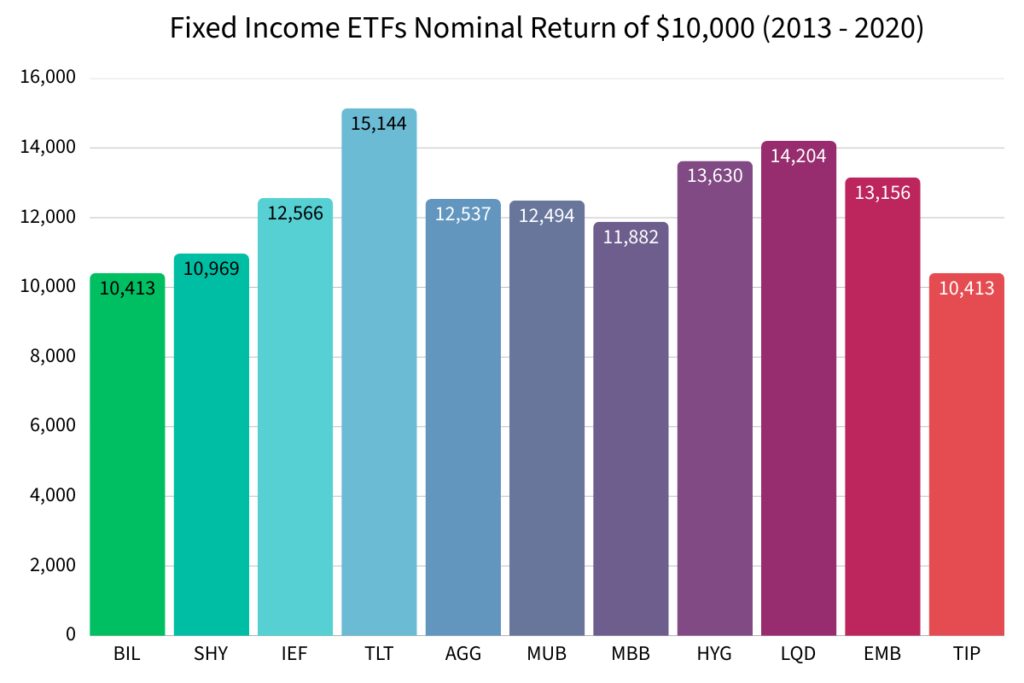
What Would $10,000 Have Grown to in each Fixed Income ETF?
Before comparing against inflation, it’s worth seeing the raw nominal dollar returns because no one wants to lose money.
Here’s what a $10,000 investment made at the start of 2013 would have been worth at the end of 2020 (assuming dividends were reinvested and you held).
Nominal returns tell us whether you made money. But the important question for investors, especially retirees, is whether your returns actually kept up with the cost of living.
Did Fixed Income ETFs Beat Inflation (CPI) From 2013 to 2020?
The most widely used measure of consumer price inflation is the Consumer Price Index (CPI). The CPI CAGR from 2013 to 2020 was 1.58%. Any ETF below that number lost ground to consumer inflation in real terms.
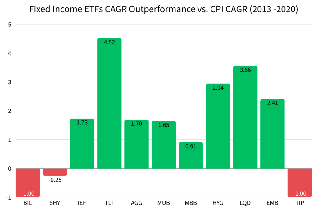
This matters most for retirees and income-focused investors. If your fixed income portfolio is yielding less than inflation, your purchasing power is shrinking year over year.
Beating CPI is the minimum bar. But there’s a stricter measure of real wealth generation, one that most financial analysis skips entirely.
Fixed Income ETFs vs M2 Money Supply Growth (2013-2020)
M2 measures the total amount of money in circulation in the economy. When the Federal Reserve expands the money supply, which it did aggressively during this period, the purchasing power of every dollar you hold declines relative to that expansion. Comparing your investment returns against M2 growth gives you the truest picture of whether you actually grew real wealth.
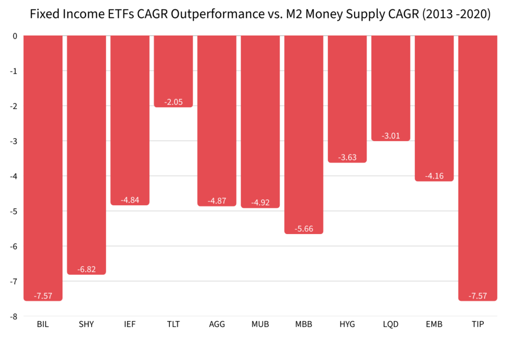
For retirees drawing income from their portfolio, underperforming M2 may be acceptable. The goal during retirement is income and capital preservation, not wealth accumulation. For younger investors with a long time horizon, holding fixed income during this period came at a real cost. Every year your bonds lagged M2, the gap between your wealth and the expanding money supply widened.
What Fixed Income Performance From 2013 to 2020 Teaches Us
The 2013–2020 period was defined by one major force: interest rate policy. The Federal Reserve kept short-term rates near zero for several years, then gradually raised them to around 2.00%, before cutting back to zero during the pandemic.
That single policy decision shaped every result in this analysis. Cash and short-term bonds yielded almost nothing. Long-duration bonds benefited from falling yields and rising prices. Corporate and high-yield bonds benefited from the low-rate environment pushing investors toward riskier assets.
But most importantly: no fixed income ETF generated real wealth against M2 money supply growth. In an era of aggressive monetary expansion, bonds did their job as a stabilizing force — but they were not a wealth-building vehicle.
This connects directly to why equities dominated during the same period. When cash yields nothing, investors put their money elsewhere. In my analysis of US equity style performance from 2013 to 2020, growth stocks dominated precisely because low rates made future earnings more valuable — the opposite of what happened to short-duration bonds.